Skip to content
  • Categories
  • Recent
  • Tags
  • Popular
  • Users
  • Groups
Skins
  • Light
  • Cerulean
  • Cosmo
  • Flatly
  • Journal
  • Litera
  • Lumen
  • Lux
  • Materia
  • Minty
  • Morph
  • Pulse
  • Sandstone
  • Simplex
  • Sketchy
  • Spacelab
  • United
  • Yeti
  • Zephyr
  • Dark
  • Cyborg
  • Darkly
  • Quartz
  • Slate
  • Solar
  • Superhero
  • Vapor

  • Default (Cyborg)
  • No Skin
Collapse
Diagram Community Logo
D

Dropek

@Dropek
About
Posts
5
Topics
3
Groups
0
Followers
0
Following
0

Posts

Recent Best Controversial

  • Accessibility in diagrams (GoJS)
    D Dropek

    Problem 🤔

    The GoJS library offers some solutions to enhance accessibility, but they are limited and fairly straightforward. In Synergy, we have implemented additional solutions that can further improve accessibility.

    One of the missing aspects is accessibility support for the palette component. The default GoJS palette does not have built-in keyboard support which means we neither can navigate through palette elements only with arrow keys nor place them on the diagram without using mouse. These are very important aspects of web accessibility since there are users that rely only on the keyboards since they cannot use mouse because of different disabilities.

    Thanks to the solution below, we will be able to add nodes using only the keyboard. Additionally, we will leverage an external library to create the palette using HTML, which will enhance both the UI and UX of the palette items. The HTML palette has many advantages over the canvas one. Not only from accessibility aspects but it gives much more customizations options.

    This example uses dnd-kit, a React library that helps handle drag-and-drop functionality and adds keyboard support by default. Therefore, the example is written in React. However, most frontend frameworks/libraries have their own drag-and-drop solutions that can be used in a similar way.

    Solution 🤓

    Introduction

    Below, I will present only the most essential parts required for implementing the drag-and-drop functionality. Some parts of the solution might be omitted in this explanation, but the complete implementation will be linked at the end via StackBlitz, where you can see how it works.

    We will use the following libraries:

    • React
    • GoJS
    • @dnd-kit/core

    Implementation

    First, we need to wrap our Diagram and Palette components with the DndContext from @dnd-kit/core:

    // App.tsx
    
    import { DndContext } from '@dnd-kit/core';
    
    ...
    
    <DndContext onDragStart={handleOnDragStart} onDragEnd={handleOnDragEnd}>
      <div className="wrapper">
        <Diagram />
        <Palette activeItemId={activeItemId} />
      </div>
    </DndContext>
    

    In the example above, we render the Diagram and Palette components within the DndContext. We pass activeItemId to the palette, representing the ID of the currently dragged item. This will allow us to show the dragged element moving with the cursor.

    Below are the implementations of handleOnDragStart and handleOnDragEnd:

    // App.tsx
    
    import { DragEndEvent, DragStartEvent } from "@dnd-kit/core";
    
    ...
    
    // Set activeItemId on drag start
    const handleOnDragStart = (event: DragStartEvent) =>
      setActiveItemId(event.active.id as string);
    
    const handleOnDragEnd = ({
      over,
      active,
      activatorEvent,
      delta,
    }: DragEndEvent) => {
      setActiveItemId(null);
      if (over?.id !== "diagram" || !diagram?.div || !active.data) {
        return;
      }
      let startX = 0;
      let startY = 0;
      // The data below is passed by the palette item, providing the starting position when dragging begins.
      const data = active.data.current as {
        x: number;
        y: number;
        width: number;
        height: number;
      };
      // Determine startX and startY depending on whether dragging was initiated via mouse or keyboard.
      if (
        activatorEvent instanceof PointerEvent ||
        activatorEvent instanceof MouseEvent
      ) {
        startX = activatorEvent.clientX;
        startY = activatorEvent.clientY;
      } else {
        startX = data.x;
        startY = data.y;
      }
      const diagramRect = diagram.div.getBoundingClientRect();
      const x = startX + delta.x - diagramRect.x - (data.width * diagram.scale) / 2;
      const y =
        startY + delta.y - diagramRect.y - (data.height * diagram.scale) / 2;
    
      diagram.commit(() => {
        // Add node with calculated position
        diagram.model.addNodeData({
          location: go.Point.stringify(
            diagram.transformViewToDoc(new go.Point(x, y))
          ),
          text: `Node ${activeItemId}`,
        });
      });
    };
    

    Next, we need to make the Diagram a droppable area so that users can drop nodes onto it:

    // Diagram.tsx
    
    import { useDroppable } from '@dnd-kit/core';
    
    ...
    
    const diagramRef = useRef<HTMLDivElement>(null);
    const { setNodeRef: setDroppableRef } = useDroppable({
      id: "diagram",
    });
    
    ...
    
    setDroppableRef(diagramRef.current);
    
    ...
    
    <div className="diagram" ref={diagramRef} />
    

    The final step is to prepare the Palette and PaletteItem components to enable dragging from the palette:

    // PaletteItem.tsx
    
    import { useEffect, useRef } from "react";
    import { useDraggable } from "@dnd-kit/core";
    
    export function PaletteItem({ id }: { id: string }) {
      const ref = useRef<HTMLDivElement | null>(null);
      const rect = ref.current?.getBoundingClientRect();
      const { attributes, listeners, setNodeRef } = useDraggable({
        id,
        data: rect
          ? {
              x: rect.x + 40,
              y: rect.y + 20,
              width: rect.width,
              height: rect.height,
            }
          : undefined,
      });
    
      useEffect(() => {
        if (ref.current) {
          setNodeRef(ref.current);
        }
      }, [ref, setNodeRef]);
    
      return (
        <div ref={ref} {...attributes} {...listeners}>
          Node {id}
        </div>
      );
    }
    

    The code above is a complete example of the PaletteItem component, which renders a simple palette item. We call useDraggable to make the element draggable, passing its position and size as data. The x and y values represent the center point, since GoJS nodes have their locationSpot set to the center. This data is used inside the handleOnDragStart function in App.tsx.

    // Palette.tsx
    import { DragOverlay } from '@dnd-kit/core';
    
    ...
    
    <DragOverlay dropAnimation={null}>
        {activeItemId ? <PaletteItem id={activeItemId} /> : null}
    </DragOverlay>
    

    Inside the Palette component, we render a PaletteItem for each item. Additionally, we implement the DragOverlay using the same PaletteItem component. This ensures that the dragged element looks exactly like the one inside the palette.

    Summary

    The above code sections are sufficient to enable keyboard support for the palette, which is provided by default by @dnd-kit/core. The key is to wrap everything properly so that it integrates well with GoJS.

    The complete solution can be found here: StackBlitz

  • Enhancing GoJS Zoom Functionality: A Better Approach to `zoomToRect`
    D Dropek

    Enhancing GoJS Zoom Functionality: A Better Approach to zoomToRect

    Introduction

    When working with GoJS diagrams, one of the most common requirements is to focus the view on specific nodes or areas of the diagram. While GoJS provides built-in methods like zoomToFit() and zoomToRect(), these methods have several limitations that can affect the user experience in real-world applications.

    In this post, I'll explore how we can create an enhanced version of the zoom functionality that addresses these limitations and provides a more polished user experience. We'll look at:

    • Adding smooth animations for zoom transitions
    • Providing precise control over padding around the zoomed area
    • Accounting for floating UI elements (like toolbars or panels) when calculating zoom bounds
    • Creating a more intuitive zoom behavior that considers the diagram's context

    Current Limitations

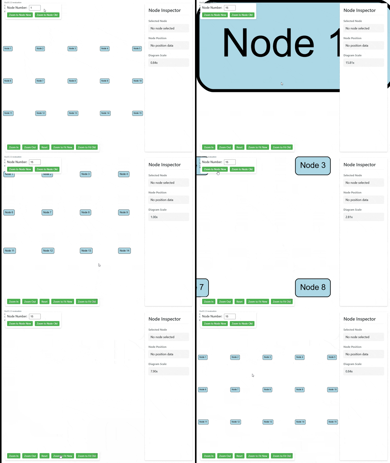
    Let's examine the current behavior of GoJS's zoom functionality, particularly when working with floating UI elements. In the demonstration below, we can see several issues:

    gif-1.gif

    1. Abrupt Transitions: The diagram jumps directly to the target node without any smooth animation, creating a jarring user experience.

    2. Improper Centering: When using centerRect() or zoomToFit(), the diagram doesn't properly account for floating UI elements. As shown in the GIF, the node is not centered vertically in the available space, as it doesn't consider the floating toolbar at the top.

    3. Inconsistent Padding: The current implementation doesn't provide fine-grained control over padding around the zoomed area, often resulting in nodes being either too close to the edges or having inconsistent spacing.

    Implementation

    Let's start by creating a new utility function that will handle our enhanced zoom functionality. We'll create this in a new file called zoomToRect.ts:

    import * as go from "gojs";
    
    type UiElement = {
      element: HTMLElement;
      side: "top" | "bottom" | "left" | "right";
    };
    
    type ZoomToRectOptions = {
      uiElements?: UiElement[];
      easing?: go.EasingFunction;
      scale?: number;
      duration?: number;
    };
    
    export function zoomToRect(
      diagram: go.Diagram,
      rect: go.Rect,
      options?: ZoomToRectOptions
    ): Promise<void> {}
    

    This utility function provides enhanced zooming capabilities for GoJS diagrams by:

    1. Taking a diagram and target rectangle to zoom to
    2. Accepting optional configuration for:
      • UI elements to avoid overlapping (like toolbars and controls)
      • Custom easing function for smooth animations
      • Target scale factor
      • Animation duration

    This will be enough for a base function, of course depending on your requirements you will be able to modify this method to fit your needs.

    We will start with writing logic to calculate padding of UI elements which float over the diagram. Thanks to that we will have the real viewport size of the diagram.

    function calculateUiPadding(
      diagram: go.Diagram,
      uiElements: UiElement[] = []
    ): go.Margin {
      const margin = new go.Margin(0, 0, 0, 0);
      if (!diagram?.div) {
        return margin;
      }
      const diagramRect = diagram.div.getBoundingClientRect();
    
      for (const { element, side } of uiElements) {
        const elementRect = element.getBoundingClientRect();
        if (side === "bottom") {
          margin.bottom = Math.max(
            margin.bottom,
            diagramRect.bottom - elementRect.top
          );
        } else if (side === "left") {
          margin.left = Math.max(margin.left, elementRect.right - diagramRect.left);
        } else if (side === "right") {
          margin.right = Math.max(
            margin.right,
            diagramRect.right - elementRect.left
          );
        } else if (side === "top") {
          margin.top = Math.max(margin.top, elementRect.bottom - diagramRect.top);
        }
      }
    
      return margin;
    }
    

    Above function calculates margin of every side for all of the passed UI elements.

    We need to know the side on which the UI element is to properly get the padding. Then we are trying to find the padding and on every side we are extracting the element which covers the diagram the most since there can be more than one element on every side.

    Our next step will be firstly using above method in our core logic and properly apply padding to passed properties.

    export function zoomToRect(
      diagram: go.Diagram,
      rect: go.Rect,
      options?: ZoomToRectOptions
    ): Promise<void> {
      const uiPadding = calculateUiPadding(diagram, options?.uiElements); // Use above method
      const diagramPadding =
        typeof diagram.padding === "number"
          ? new go.Margin(diagram.padding)
          : diagram.padding; // Get diagram padding in proper format
    
      const actualViewportWidth =
        diagram.viewportBounds.width * diagram.scale -
        uiPadding.left -
        uiPadding.right; // Calculate real viewport width
      const actualViewportHeight =
        diagram.viewportBounds.height * diagram.scale -
        uiPadding.top -
        uiPadding.bottom; // Calculate real viewport height
      const actualRectWidth =
        rect.width + diagramPadding.left + diagramPadding.right; // Calculate real rect width to fix on the screen
      const actualRectHeight =
        rect.height + diagramPadding.top + diagramPadding.bottom; // Calculate real rect height to fix on the screen
      const actualRectX = rect.x - diagramPadding.left; // Calculate real rect X position
      const actualRectY = rect.y - diagramPadding.top; // Calculate real rect Y position
    }
    

    We need to properly align all of the sizes depending on our UI padding and diagram padding.

    As a next step we will extract previous position and previous scale.

    ...
    
    const prevPosition = diagram.position.copy();
    const prevScale = diagram.scale;
    
    ...
    

    Now we can calculate new values

    ...
    
    const newScale = Math.min(
      options?.scale || Infinity,
      actualViewportWidth / actualRectWidth
    );
    const freeVerticalSpace = actualViewportHeight / newScale - actualRectHeight;
    const freeHorizontalSpace = actualViewportWidth / newScale - actualRectWidth;
    
    const newX =
    actualRectX - uiPadding.left / newScale - freeHorizontalSpace / 2;
    const newY = actualRectY - uiPadding.top / newScale - freeVerticalSpace / 2;
    
    const newPosition = new go.Point(newX, newY);
    
    ...
    

    Firstly we calculate new scale. We can either take it from the passed prop if there is a need of some specific zoom level or we are disabling zooming in and out. If scale is not passed we take Infinity so it will be always greater than second argument which is the actual width of our viewport divided by actual rect width.

    Thanks to new scale we can calculate left horizontal and vertical space which will be used to align new document position so our element will be centered in both axes.

    Then we calculate new position of the document getting our actual rect x and y, minus scaled properly ui padding and moved by the half of the left space so we ensure that our rect will be centered in left space in the middle.

    As a last step we just need to run the animation

    ...
    
    return new Promise<void>((resolve) => {
      const animation = new go.Animation();
      animation.duration = options?.duration || 500;
      animation.easing = options?.easing || go.Animation.EaseInOutQuad;
      animation.add(diagram, "position", prevPosition, newPosition);
      animation.add(diagram, "scale", prevScale, newScale);
      animation.finished = () => {
        window.requestAnimationFrame(() => resolve());
      };
      animation.start();
    });
    

    We are creating promise which is resolved when the animation finishes. Thanks to that we can await our zoom method if we want to for example firstly zoom to node and then highlight or do something with it.

    How to use it?

    If we want now to call our method we just need to call it with proper properties as in example below:

    zoomToRect(diagram, node.actualBounds, {
      uiElements: [
        { element: document.getElementById("toolbar")!, side: "top" },
        {
          element: document.getElementById("inspector-sidebar")!,
          side: "right",
        },
        {
          element: document.getElementById("zoom-controls")!,
          side: "bottom",
        },
      ],
    });
    

    Above code will zoom to the node and taking into account some of the HTML UI elements.

    If we would like to have zoomToFit() functionality we can just pass proper rect to our custom zoomToRect() method as below.

    export const zoomToFit = (diagram: go.Diagram, options?: ZoomToRectOptions) => {
      if (!diagram) {
        return new go.Rect(0, 0);
      }
      const visibleNodes = diagram.nodes.filter((node) => node.isVisible());
      const bounds = diagram.computePartsBounds(visibleNodes);
      zoomToRect(diagram, bounds, options);
    };
    

    Result

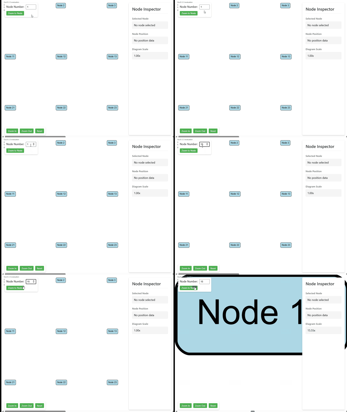
    gif-2.gif

    Summary

    This enhanced zoom functionality provides a significant improvement over GoJS's built-in zoom methods. By implementing smooth animations, proper UI element handling, and customizable options, we've created a more polished and user-friendly zoom experience. The solution is flexible enough to handle both single-node focusing, full diagram fitting or any other custom rectangle.

    The code itself is pretty simple which enable modifying it and aligning for your needs any way you want.


  • Type-safe bindings in GoJS
    D Dropek

    Type-safe bindings

    Problem

    GoJS bindings are not typed as good as they could be, which can lead to issues when working with complex templates and many bindings. Both target and source properties can be any string, which isn't the biggest issue, but the real problem arises when managing numerous templates and bindings. Since these bindings rely on our node or link data, we must ensure that when a property name changes, all related bindings across the application are updated.

    Another limitation is that the converter method's first argument can be of any type, meaning we need to manually type it each time we initialize a binding. This can result in incorrect types. Worse, when we change the type of our node data, we may not realize that the bindings are incorrect until we encounter issues during testing. It would be ideal to catch these problems during development rather than at runtime.

    Solution

    In one of my projects, I implemented a small utility function that helps with typing, manages proper types, and alerts me when bindings need to be updated after modifying the types of node data. It also ensures that the converter logic is correct when the type of data changes (e.g., from an object to a string).

    First, we need to create a factory function to generate separate functions, each pre-typed based on our data. This is useful since we can have different types for node data, link data, or model data.

    export const createBindingBase =
      <N extends go.ObjectData>() =>
      <T extends keyof N>(
        target: string,
        source: T,
        converter: (arg: N[T], targetObj: go.GraphObject) => void
      ) =>
        new go.Binding(target, String(source), converter);
    

    In the code above, we created the createBindingBase method, which accepts a generic type representing our data. It returns the original go.Binding instance but ensures that the key of the data object is correct. Additionally, we no longer need to type the value in the converter method because it is inferred from our data object.

    Next, we can create a method for ourselves without needing to pass the generic type each time:

    type NodeData = {
      a: string;
      b: boolean;
    };
    
    export const createDataBinding = createBindingBase<NodeData>();
    

    Now, we can use this binding method easily:

    createDataBinding('fill', 'a', (a) => a); // Here typescript will know 'a' is a string
    createDataBinding('fill', 'b', (b) => b); // Here typescript will know 'b' is a boolean
    createDataBinding('fill', 'c', (c) => c); // Here typescript will throw an error
    

    This approach handles data bindings, but it would be useful to have similar behavior for model data. To achieve this, we need to call ofModel() on our binding. Here’s how we can extend the functionality:

    type CreateBindingParams<N extends go.ObjectData> = Parameters<
      ReturnType<typeof createBindingBase<N>>
    >;
    
    export const createModelBinding = (...args: CreateBindingParams<ModelData>) =>
      createBindingBase()(...args).ofModel();
    

    Now, we can use the createModelBinding method in the same way as createDataBinding, but it will bind to model data properties and infer types from them.

    Conclusion

    The utility functions for type-safe bindings are highly useful and can significantly speed up development by catching errors early, before we encounter them during runtime. It’s also convenient because we don't need to jump between type definitions and bindings to ensure everything is typed correctly.

    However, there are some limitations. For example, this solution doesn't handle all scenarios, such as two-way bindings. But it provides a solid starting point and can be extended to cover more use cases.

  • Login

  • Don't have an account? Register

Powered by NodeBB Contributors
  • First post
    Last post
0
  • Categories
  • Recent
  • Tags
  • Popular
  • Users
  • Groups