Enhancing GoJS Zoom Functionality: A Better Approach to zoomToRect
Introduction
When working with GoJS diagrams, one of the most common requirements is to focus the view on specific nodes or areas of the diagram. While GoJS provides built-in methods like zoomToFit() and zoomToRect(), these methods have several limitations that can affect the user experience in real-world applications.
In this post, I'll explore how we can create an enhanced version of the zoom functionality that addresses these limitations and provides a more polished user experience. We'll look at:
- Adding smooth animations for zoom transitions
- Providing precise control over padding around the zoomed area
- Accounting for floating UI elements (like toolbars or panels) when calculating zoom bounds
- Creating a more intuitive zoom behavior that considers the diagram's context
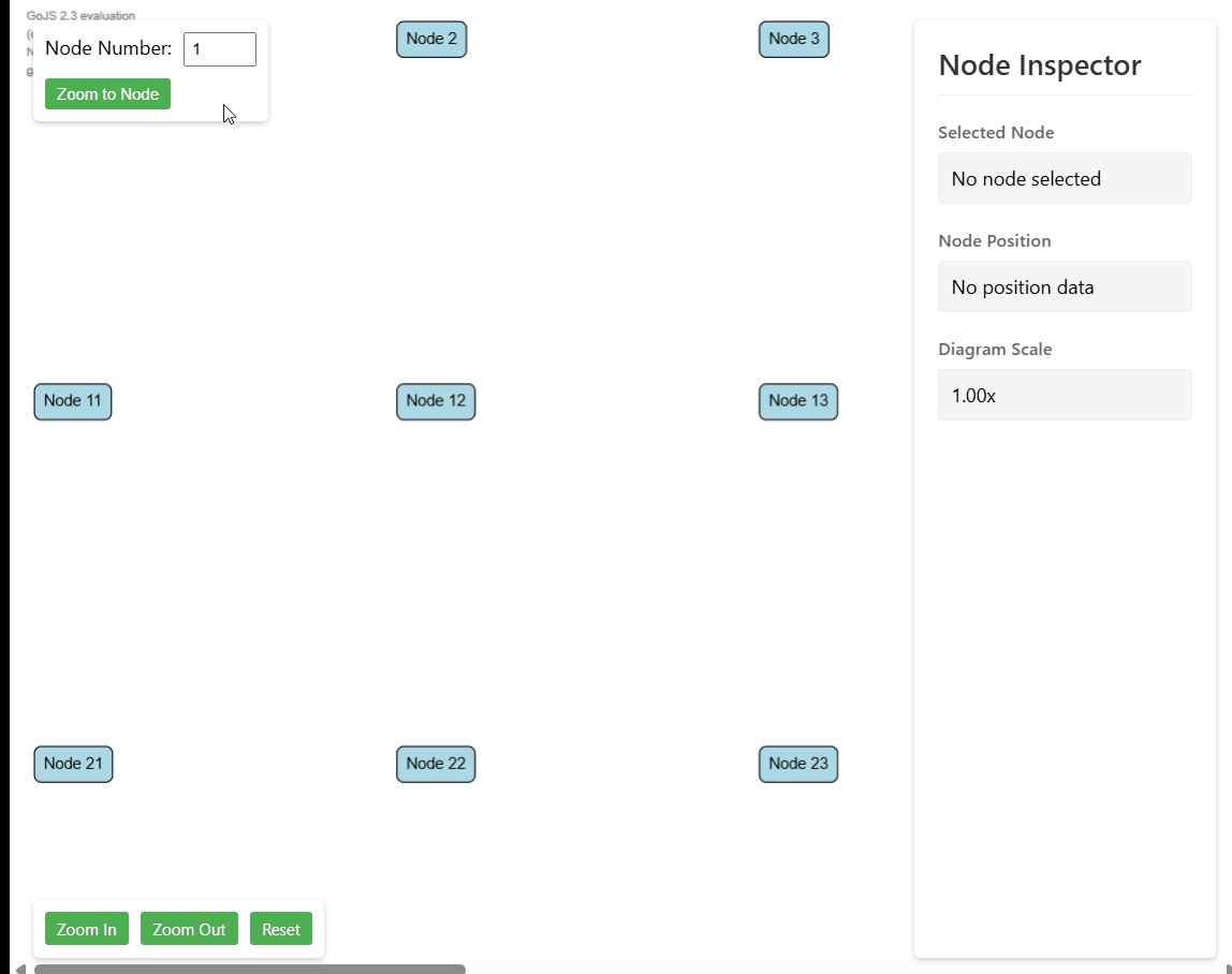
Current Limitations
Let's examine the current behavior of GoJS's zoom functionality, particularly when working with floating UI elements. In the demonstration below, we can see several issues:
-
Abrupt Transitions: The diagram jumps directly to the target node without any smooth animation, creating a jarring user experience.
-
Improper Centering: When using
centerRect()orzoomToFit(), the diagram doesn't properly account for floating UI elements. As shown in the GIF, the node is not centered vertically in the available space, as it doesn't consider the floating toolbar at the top. -
Inconsistent Padding: The current implementation doesn't provide fine-grained control over padding around the zoomed area, often resulting in nodes being either too close to the edges or having inconsistent spacing.
Implementation
Let's start by creating a new utility function that will handle our enhanced zoom functionality. We'll create this in a new file called zoomToRect.ts:
import * as go from "gojs";

type UiElement = {
  element: HTMLElement;
  side: "top" | "bottom" | "left" | "right";
};

type ZoomToRectOptions = {
  uiElements?: UiElement[];
  easing?: go.EasingFunction;
  scale?: number;
  duration?: number;
};

export function zoomToRect(
  diagram: go.Diagram,
  rect: go.Rect,
  options?: ZoomToRectOptions
): Promise<void> {}
This utility function provides enhanced zooming capabilities for GoJS diagrams by:
- Taking a diagram and target rectangle to zoom to
- Accepting optional configuration for:
- UI elements to avoid overlapping (like toolbars and controls)
- Custom easing function for smooth animations
- Target scale factor
- Animation duration
This will be enough for a base function, of course depending on your requirements you will be able to modify this method to fit your needs.
We will start with writing logic to calculate padding of UI elements which float over the diagram. Thanks to that we will have the real viewport size of the diagram.
function calculateUiPadding(
  diagram: go.Diagram,
  uiElements: UiElement[] = []
): go.Margin {
  const margin = new go.Margin(0, 0, 0, 0);
  if (!diagram?.div) {
    return margin;
  }
  const diagramRect = diagram.div.getBoundingClientRect();

  for (const { element, side } of uiElements) {
    const elementRect = element.getBoundingClientRect();
    if (side === "bottom") {
      margin.bottom = Math.max(
        margin.bottom,
        diagramRect.bottom - elementRect.top
      );
    } else if (side === "left") {
      margin.left = Math.max(margin.left, elementRect.right - diagramRect.left);
    } else if (side === "right") {
      margin.right = Math.max(
        margin.right,
        diagramRect.right - elementRect.left
      );
    } else if (side === "top") {
      margin.top = Math.max(margin.top, elementRect.bottom - diagramRect.top);
    }
  }

  return margin;
}
Above function calculates margin of every side for all of the passed UI elements.
We need to know the side on which the UI element is to properly get the padding. Then we are trying to find the padding and on every side we are extracting the element which covers the diagram the most since there can be more than one element on every side.
Our next step will be firstly using above method in our core logic and properly apply padding to passed properties.
export function zoomToRect(
  diagram: go.Diagram,
  rect: go.Rect,
  options?: ZoomToRectOptions
): Promise<void> {
  const uiPadding = calculateUiPadding(diagram, options?.uiElements); // Use above method
  const diagramPadding =
    typeof diagram.padding === "number"
      ? new go.Margin(diagram.padding)
      : diagram.padding; // Get diagram padding in proper format

  const actualViewportWidth =
    diagram.viewportBounds.width * diagram.scale -
    uiPadding.left -
    uiPadding.right; // Calculate real viewport width
  const actualViewportHeight =
    diagram.viewportBounds.height * diagram.scale -
    uiPadding.top -
    uiPadding.bottom; // Calculate real viewport height
  const actualRectWidth =
    rect.width + diagramPadding.left + diagramPadding.right; // Calculate real rect width to fix on the screen
  const actualRectHeight =
    rect.height + diagramPadding.top + diagramPadding.bottom; // Calculate real rect height to fix on the screen
  const actualRectX = rect.x - diagramPadding.left; // Calculate real rect X position
  const actualRectY = rect.y - diagramPadding.top; // Calculate real rect Y position
}
We need to properly align all of the sizes depending on our UI padding and diagram padding.
As a next step we will extract previous position and previous scale.
...

const prevPosition = diagram.position.copy();
const prevScale = diagram.scale;

...
Now we can calculate new values
...

const newScale = Math.min(
  options?.scale || Infinity,
  actualViewportWidth / actualRectWidth
);
const freeVerticalSpace = actualViewportHeight / newScale - actualRectHeight;
const freeHorizontalSpace = actualViewportWidth / newScale - actualRectWidth;

const newX =
actualRectX - uiPadding.left / newScale - freeHorizontalSpace / 2;
const newY = actualRectY - uiPadding.top / newScale - freeVerticalSpace / 2;

const newPosition = new go.Point(newX, newY);

...
Firstly we calculate new scale. We can either take it from the passed prop if there is a need of some specific zoom level or we are disabling zooming in and out. If scale is not passed we take Infinity so it will be always greater than second argument which is the actual width of our viewport divided by actual rect width.
Thanks to new scale we can calculate left horizontal and vertical space which will be used to align new document position so our element will be centered in both axes.
Then we calculate new position of the document getting our actual rect x and y, minus scaled properly ui padding and moved by the half of the left space so we ensure that our rect will be centered in left space in the middle.
As a last step we just need to run the animation
...

return new Promise<void>((resolve) => {
  const animation = new go.Animation();
  animation.duration = options?.duration || 500;
  animation.easing = options?.easing || go.Animation.EaseInOutQuad;
  animation.add(diagram, "position", prevPosition, newPosition);
  animation.add(diagram, "scale", prevScale, newScale);
  animation.finished = () => {
    window.requestAnimationFrame(() => resolve());
  };
  animation.start();
});
We are creating promise which is resolved when the animation finishes. Thanks to that we can await our zoom method if we want to for example firstly zoom to node and then highlight or do something with it.
How to use it?
If we want now to call our method we just need to call it with proper properties as in example below:
zoomToRect(diagram, node.actualBounds, {
  uiElements: [
    { element: document.getElementById("toolbar")!, side: "top" },
    {
      element: document.getElementById("inspector-sidebar")!,
      side: "right",
    },
    {
      element: document.getElementById("zoom-controls")!,
      side: "bottom",
    },
  ],
});
Above code will zoom to the node and taking into account some of the HTML UI elements.
If we would like to have zoomToFit() functionality we can just pass proper rect to our custom zoomToRect() method as below.
export const zoomToFit = (diagram: go.Diagram, options?: ZoomToRectOptions) => {
  if (!diagram) {
    return new go.Rect(0, 0);
  }
  const visibleNodes = diagram.nodes.filter((node) => node.isVisible());
  const bounds = diagram.computePartsBounds(visibleNodes);
  zoomToRect(diagram, bounds, options);
};
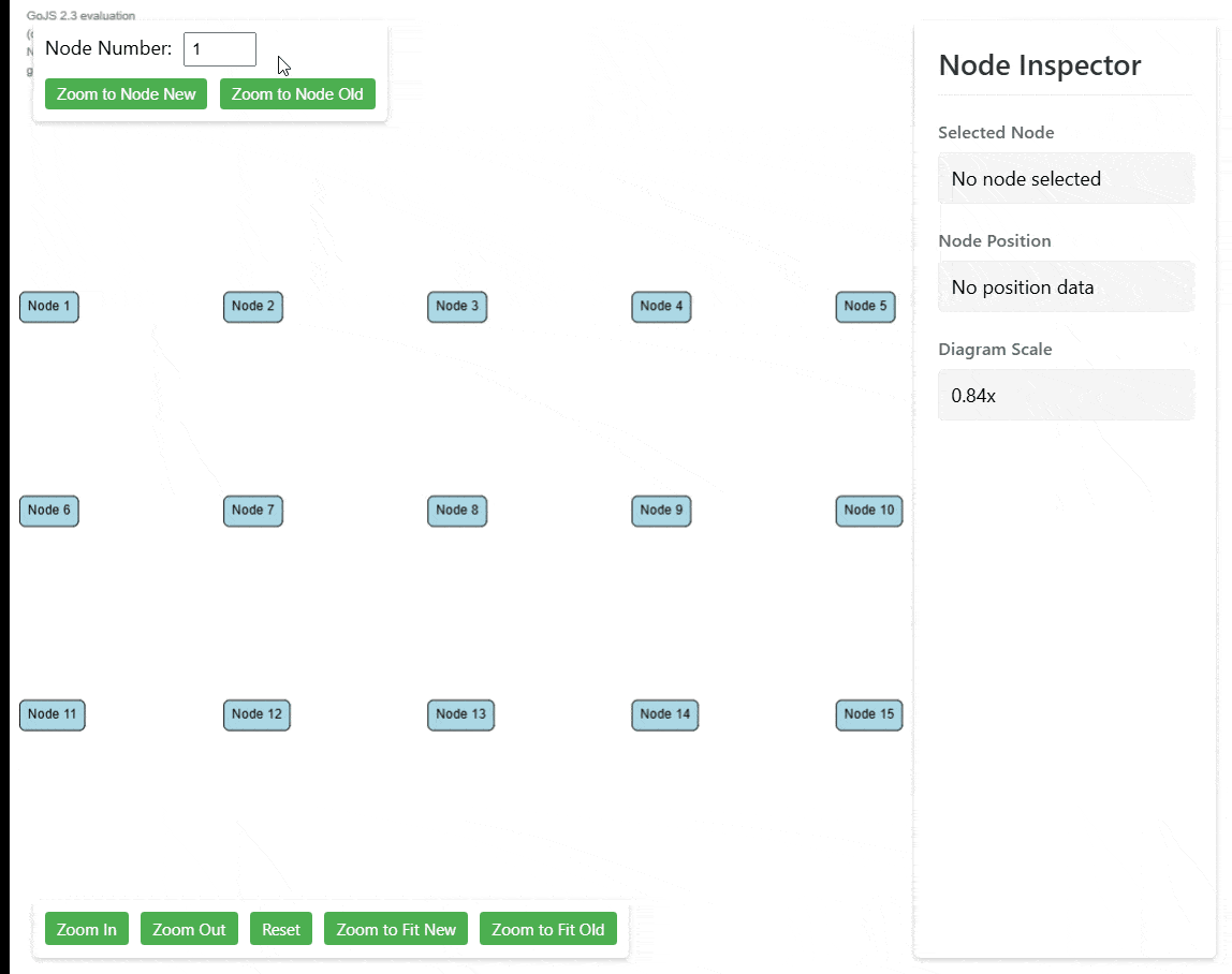
Result
Summary
This enhanced zoom functionality provides a significant improvement over GoJS's built-in zoom methods. By implementing smooth animations, proper UI element handling, and customizable options, we've created a more polished and user-friendly zoom experience. The solution is flexible enough to handle both single-node focusing, full diagram fitting or any other custom rectangle.
The code itself is pretty simple which enable modifying it and aligning for your needs any way you want.
 ️
️

 ). I will explain what happens and how, so you can also tailor navigation to your needs.

